The ancient Hellenic tradition of the Olympics has managed to stay almost as relevant today as it was in times long past, representing the quintessential gathering of nations to set aside their differences for pure, unadulterated sport.
In the spirit of these once-every-two-year events, the host country is tasked with creating a logo worthy of representing the Olympics for that year. Here are a handful of the some of the most stunning and representative Olympic logos ever created; spanning from Paris 1924 to London 2012:
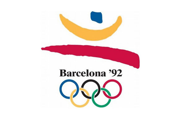
1. In 1992, the Summer Olympics were memorably held in Barcelona Spain; and symbolically acted as the culmination of the threat of what would have been the world’s worst conflict in history – the Cold War. Perhaps that’s why the brilliantly simple but encompassing logo of the bare essentials of a human figure soaring over the always-present Olympic rings was so significant. It captured the human spirit and its ability to rise; while simultaneously capturing the essence of sport. You could easily envision a high-jumper, an explosive 100 meter dasher, a swimmer leaping for joy or a fencer on the attack in the simple figure of the olympic logos.
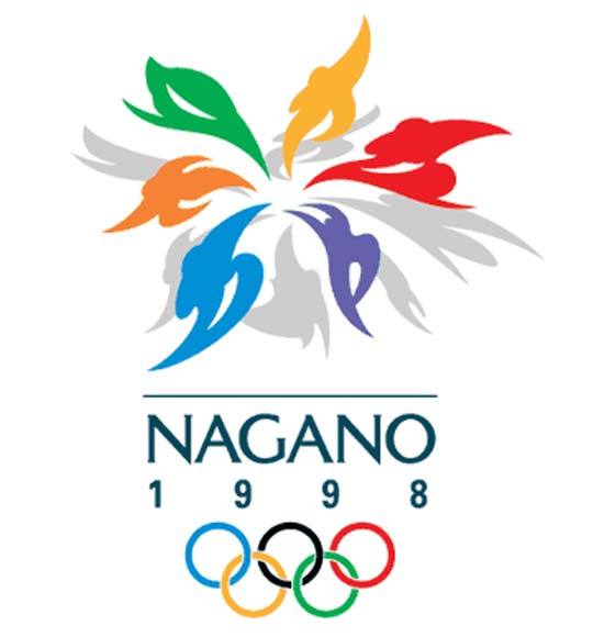
2. The Olympic logo of 1998 had the flair of Japanese architecture written all over it. Nagano reached deep into tradition and pulled out a beautiful, flaring logo with the multiple meanings that much of Japanese art displays; a fire petal bloomed with the vaguely recognizable figures of Olympic athletes engaging in some sport or other. The logo was officially named the “Snowflower”, given that 1998 was the year for the Winter Olympics and the many ice-bound sports that dominated there. The logo itself is eye-catching and completely encompasses the essence of the Olympics in the context of the host country.
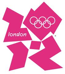
3. The most recent of the Olympic logos was the London 2012 celebration of amicable competition between nations. This logo is starkly different from most of those of past Olympics; because it represents a break from the static and symmetric works of yesterday. The London 2012 Olympic logo almost seems hard-edged and technical, to represent perhaps the unique merger of technology and the Games of that year. Never before, for example, has so much technology been involved, from Smartphones, tablets and laptops, to social media and branding. The mobile technology world took over in 2012, and the logo tries to capture the transition.
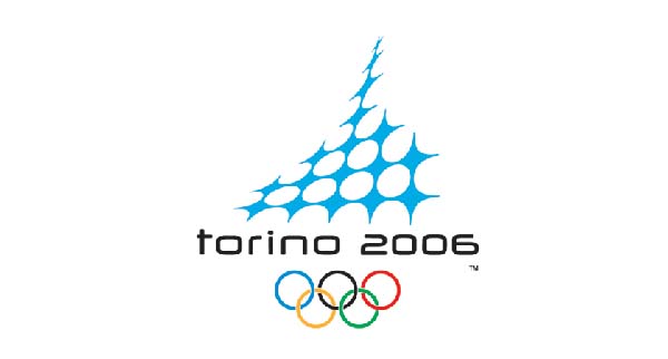
4. In 2004, Turin (in Italy) hosted the Winter Olympics; which was the third time in 46 years Italy had drawn the honor. They honored it with a soaring Olympic logo of a major Italian landmark, and succeeded in combining two other meanings into the arresting blue structure: that of the growing presence of technology in the Olympics manifested at that time, as well as the intertwined community of nations that makes the Olympics possible in the first place. To top it all off; the logo is drawn in blue ice crystals as an ode to the winter season.
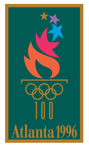
5. The Olympic logo of summer 1996 was representative of the American city of Atlanta. The powerful imagery of a stylized torch, with its base comprised by the universal Olympic symbol of 5 interlocking rings and the number 100 – to represent the centennial nature of the event – held a vibrant flame that petered out into stars. That year, the torch for the opening of the games was lit by one of the most significant athletes of all time — Muhammad Ali. The torch symbol embodies the fire of athletic competition, and gives ode to the place and time in which it was held.
Zeena Bushnaq is a Managing Director at Brandbucket.com. She is an online marketing specialist with a knack for social strategies and SEO.Also a spreadsheet guru, workaholic and perfectionist with a small dose of OCD.

