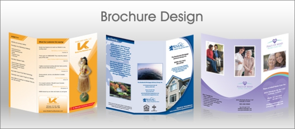
The first objective is to encourage people to pick up the brochure and look at it, so you need to lead them through your company’s message stage by stage, in a captivating and memorable way. The front cover, therefore, needs to attract the most attention with interesting design and engaging text.
There is a tendency for companies to put too much information in their corporate brochures; many are too wordy and readers often lose interest after a while, even if they were attracted to the brochure initially. The message should be succinct, and delivered in a meaningful way that will leave potential customers wanting to find out more about your company.

Concise, engaging, with excellent design
Business owners need to sit down with their designers and decide exactly what information should be included in the brochure. This will dictate the number of pages and the layout required, and the designer will get a feel for what the company stands for, the image it wants to portray, and the services or products on offer.
There are so many corporate brochures that contain the same type of information, presented in exactly the same way, that by using corporate brochure design as a way to differentiate yourself from other companies and stand out from the crowd, your brochures can become one of the main ways of attracting custom.
Choosing a corporate brochure design that works for your business
When it comes to brochure design, the possibilities really are endless. Your corporate image will dictate the design of the brochure, and you may need:
- a classic, understated look and feel
- a vibrant look that will grab people’s attention with strong colours and patterns
- a simple but modern design with strong shapes and sharp images
Brochures that are tactile, using high quality paper and inks, will also encourage people to continue reading.
A picture speaks a thousand words
Skilled use of images can speak volumes to your customer, and in many ways pictures are more important than text, as they immediately grab the reader’s attention. The main criteria should be that words are concise and sentences short, so that when people look at the pages they are not overwhelmed with the amount of text. It is highly likely that they will be unwilling to wade through too much written information, and immediately lose interest.
With so much digital advertising and marketing, you can make your company stand out from the crowd simply by producing a tactile, attractive and engaging brochure. Good corporate brochure design can reveal your company’s identity in a way that is not possible online, and reach potential customers in varied markets.
This article is one of many written by design expert and online author, David Hamer.

