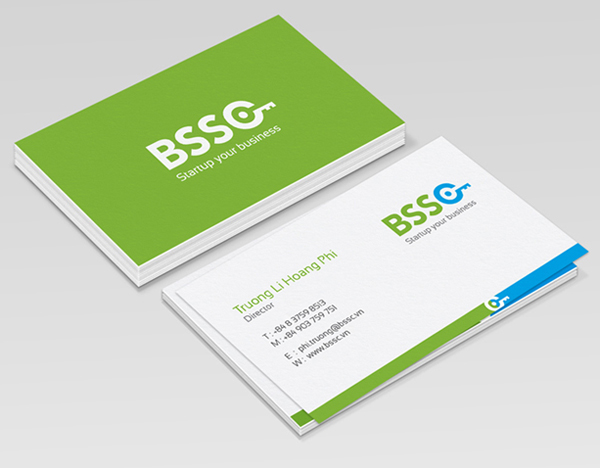
Today’s consumers are bombarded with an unprecedented amount information from hundreds of companies trying to market their services to new clients. Due to this information “overload,” it takes a little something extra to help a company, and the services it offers, stand out from the rest of the marketing pack. Well-designed business cards are the perfect tool used to introduce a potential client to what a company has to offer.

Business cards often represent the best first chance to make a good impression. By following a few time-tested tips during the design process, it is easy to create business cards that are professionally appealing and effectively get a company’s message across to its customers.
Important Business Card Design Considerations
1. Professional-looking business cards begin with using the best quality card stock affordable. Flimsy, thinner card stock looks cheap, and unprofessional. It sends the wrong message to clients.
2. Use an easy-to-read font and font size. Business cards that use a font size that is too small to read, or is too complicated, will not be kept by customers for future reference.
3. Ink choice is an important consideration in designing business cards. Richly pigmented inks last longer and stand up to a lot of handling.
4. Use a logo and a short slogan, or tagline, to help the card be memorable to a client. A business card is an extension of a company’s brand.
5. Always include the company’s website address, email address, and other pertinent contact information. This simple step makes it easier for clients to readily contact the company.
6. Keep the card design crisp, clean, and visually appealing. A less cluttered card is easier to read and easier to remember.
7. Use the standard 3.5 X 2 inch card design. Larger cards can be difficult for clients to store and often get thrown out for this very reason. A business card can not accomplish its goal if it is not retained by the client.
Few Other Considerations to Keep in Mind When Designing Business Cards
1. The color Red stands out far more than any other color choice on business cards. It set a warm, inviting tone, and draws in the reader’s eye to the information being presented.
2. Instead of using black ink on a white background, try using white ink on a black background for creating instant visual appeal.
3. If budget constraints allow, consider using glossy paper stock or a die cut design. Anything that is not too busy-looking really helps a card stand out from the rest.
Well designed business cards can go a long way towards increasing potential profits by adding new clients. Business cards have a multi-fold purpose. They should tell a client what a company sells, and give them a reason to buy from that company. By investing the small amount of time and energy needed to ensure business cards look their professional best, a company will be well on the road to accomplishing this goal.
Dominique is a Graphic Design Specialist from Sydney, Australia. Because he will only produce the highest quality designs for his clients, he will only work with the very best companies for business card printing Sydney has to offer. Away from work, Dominique likes to travel as often as possible and spend time with his family.

