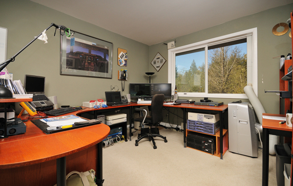
When you design your office you of course need to do so taking into consideration the principles of interior design and aesthetics. You need to create a space that looks good so that your staff feel happy and comfortable working there (as do you) and so that you make a good impression on any guests or visitors you may get.
At the same time though you also need to think about it practically, and you need to think about how it is going to affect the way you work. You’re working ’around’ your office, and so obvious it can either get in the way of what you’re doing, or it can facilitate your work. Here we will look at some practical considerations that you might overlook when designing your layout which can help ensure that your office does more of the latter and less of the former.

Power Points
One thing to consider when you choose where you are going to sit your staff is where the power sockets are in your office. If you own the building then of course you will have the option to move these and install them on an as-needed basis. However if you are renting, then you will have to make do with them where they are, and that means you’ll have to choose where you put your furniture based on where they are positions. Make sure that your staff can easily reach sockets, and that you don’t have multiple extensions trailing across the floor.
Lighting
The way you organize your office affects how much lighting you need. If you have lots of people in one place, then a central light can be used rather than lots of lights all around the office. This might seem like a small point to consider, but bear in mind that lighting costs electricity, and that electricity costs money. If you’re trying to cut overheads, then moving your desks to a central location can actually accomplish this.
Glare
Another source of lighting is of course the windows, but these can be a problem if they create glare on the monitors of your staff. As such then you should make sure that your desks are positioned so that this won’t be an issue, and so that any monitors will point away from the windows. You can get glare protectors, but of course these aren’t as useful.
Pathways
As well as thinking about how your office fitouts are going to provide for your staff when they’re sat at their desks, you also need to think about how they are going to allow for people moving around and passing through. If you have a path going through your office then you need to make sure that there are no desk corners poking out into it. At the same time you need to make sure that the paths to the storage cupboards etc. are easily accessible from any point in the office. This way you will shorten the journey from your staff’s desks to the supplies which means they’ll take less time and they’ll have more time to spend on work – increasing profits when all is said and done.
The article is contributed by Thomas Brown, who is renowned interior designer and home improvement blogger.

